

This responsive, mobile landing page was designed and developed for a special holiday discount on Webroot Mobile Security for Android mobile & tablet devices. The goal of this mobile web design project was to design and develop a responsive mobile landing page for visitors interested in this special offer.
Traffic would primarily reach the page via a link in an email newsletter sent out by the company, and although many visitors would be checking their email on desktop or laptop computers, more and more users have their email delivered to mobile devices like Android and iPhone, so having a responsive mobile landing page for this offer was critical for the mobile user experience. Additionally, this was specifically an offer for Android Mobile Security, and it was important that Android mobile & tablet users could view this responsive mobile landing page without having to zoom in on their device, and also have direct access to the Android Market to purchase and install the product immediately if they wanted to.
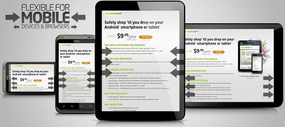
Mobile Web Design Details
Since the intended audience of this responsive mobile web design project was mobile browsers and tablets, a clean and lightweight design was used to elegantly highlight the product in use on Android phones & tablets as shown in the product image, as well as the simple messaging on the page title for the special offer. Immediately following the title, the pricing area and primary “Buy Now” call to action button on the mobile web page is featured with the full price crossed out, and the special price in a large and high contrast font. This pricing presentation and “Buy Now” functionality is also included at the bottom on the page for mobile devices so that users are able to take action after scrolling through the product features and highlights. For desktop and laptop computer browsers, the responsive mobile web page design shows the product photo large and to the right of the main column, but as the browser is re-sized, the web page layout becomes completely responsive and flexible so that the content in always visible. For mobile browsers, the web design & layout load in that responsive state, with the product photo reduced in size, and moved below the pricing, call to action, and main column product features and information. This allows the most relevant content and the primary call to action on the page to appear as close to the top as possible for mobile users on Android and iPhone devices, as well as tablets.
Technical Implementation
This responsive mobile web design layout was designed and coded around a standard 960px grid framework, and uses javascript for mobile device detection and responsive page layout adjustments on mobile and tablet devices. For screen resolutions over 960px, the full layout of the page is displayed, and for standard screen and mobile resolutions below that, the javascript mobile detection triggers changes to the CSS classes and HTML document structure to reformat the web page incrementally for the most common mobile screen resolutions.