

Print Design Projects
January 12, 2022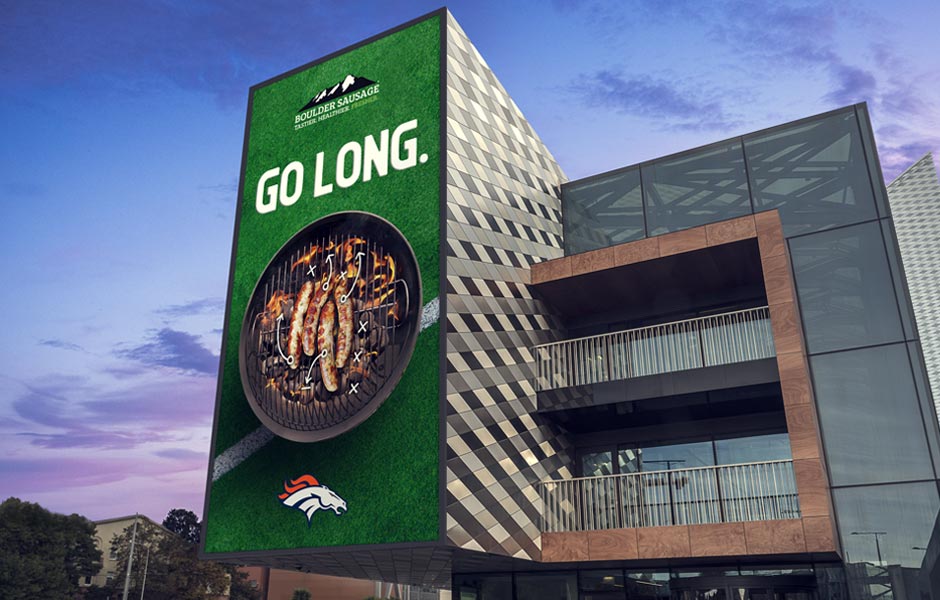
Denver Broncos / Boulder Sausage Creative Marketing Campaign
It doesn’t get better than working on creative marketing projects for great clients with great partnerships! This creative marketing campaign for Boulder Sausage, in partnership with the Denver Broncos, produced a variety of materials and assets for in-stadium placements, online digital ads, email blasts, and physical ads. Our team created fun and clever messaging and [...]
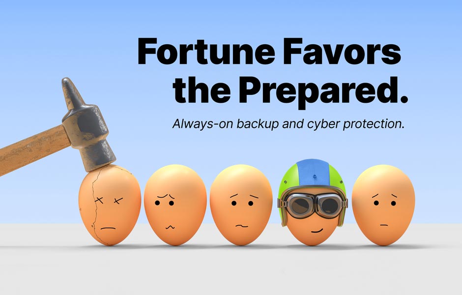
Creative Campaign Design Concepts – Fortune Favors the Prepared “Egg” concepts
Creative campaign design concepts are one of our favorite types of design projects to work on! We get to break the rules, come up with fun and creative design ideas, bring a level of personality to brands, and create something unique and memorable for our clients! The process is fluid, collaborative, and iterative with our [...]
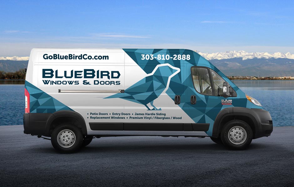
Vehicle Wrap Design for BlueBird Windows & Doors
Vehicle wrap design projects are some of our favorite creative work to take on, and we love seeing them out on the road long after the project is done! Having a professional and eye-catching vehicle wrap design for a business is one of the most effective ways to raise regional awareness and establish brand recognition [...]
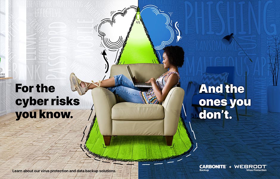
Carbonite + Webroot Global Marketing Campaign Ad Design Creative for Consumer & Business Audiences
This global marketing campaign ad creative was designed and implemented for Carbonite + Webroot across North America and EMEA markets in English, French, German, and Japanese languages. The high-level concept for this marketing campaign was “Magnifying Light”, and the final ad campaign designs bring this to life by amplifying what’s lurking in the dark or [...]
The Receptionist Branding, Logo Design, & Marketing Materials
The Receptionist for iPad is a Denver-based company that uses Cloudburst as a one-stop-shop to design their marketing materials, creative assets, and web site design and admin management. The project kicked off with logo design, branding updates, and general marketing materials, and was quickly followed by website design and development to revamp the entire look [...]
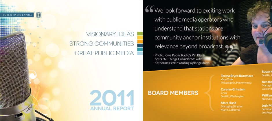
PRC Annual Report Design Services
Public Radio Capital, a national nonprofit based in Boulder, Colorado, that provides consulting services for financing public media in communities nationwide, engaged us to design & layout their 2011 annual report design. The goal of the annual report design was to incorporate professional photography, typography, layout, and design elements to create a compelling and professional [...]
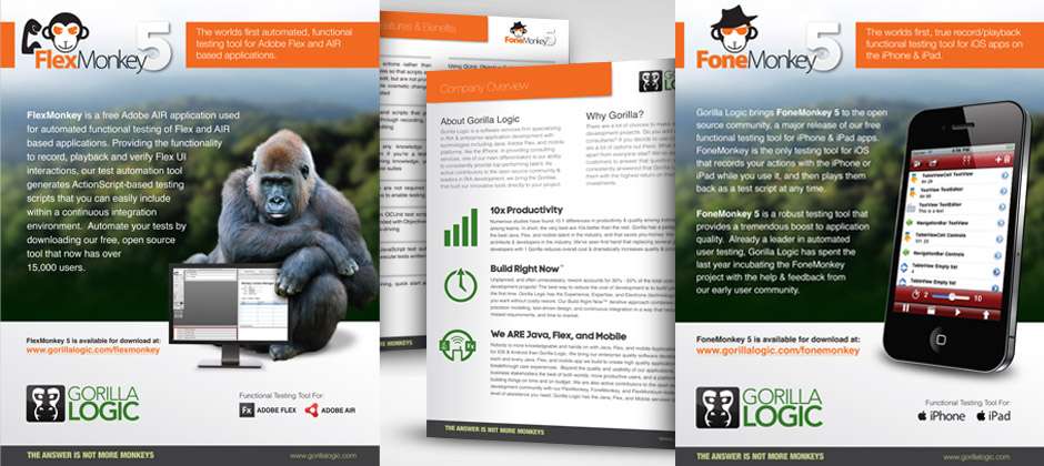
Boulder Brochure Design
Boulder’s Gorilla Logic engaged Cloudburst to update their sales and marketing brochure designs and print materials for several of their software products, as well as corporate marketing materials and other brand collateral like business cards, T-Shirt, and water bottle designs. The primary goal for this project was to create a unified, branded, and contemporary look [...]
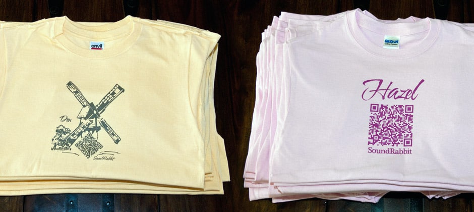
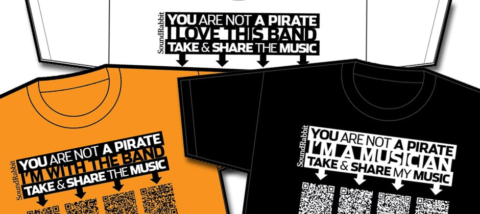
QR Code Viral Music T-Shirt
This QR Code design project was an extension of an earlier QR Code Campaign in Boulder, Co, for the band SoundRabbit, that may actually be the first-ever viral QR code t-shirt designed specifically for free music downloads! QR Codes are just like bar codes, except that they can be “read” by free QR reader Apps [...]
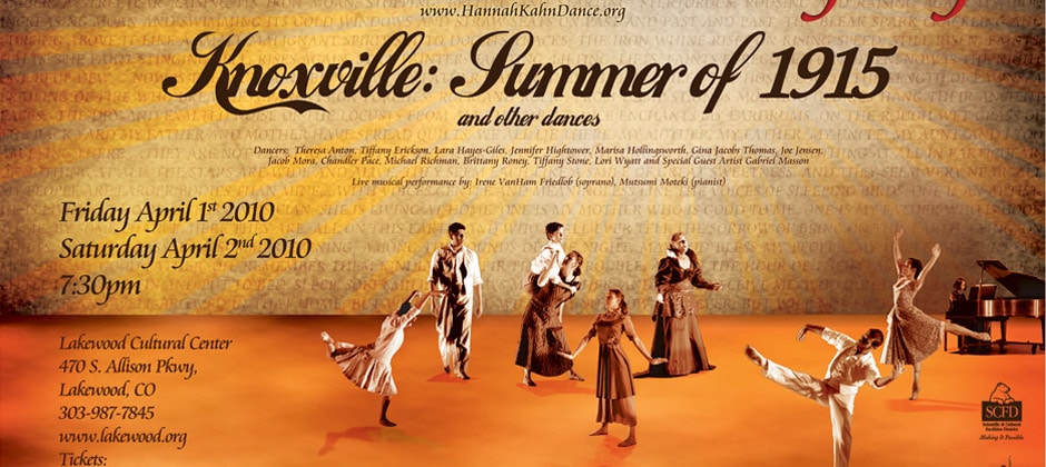
Lakewood Poster Design
The event poster design was created to promote the spring, 2011, Hannah Kahn Dance Company performance of Knoxville: Summer of 1915 at the Lakewood Cultural Center, in Lakewood Colorado. In addition to these eye-catching 11×17 posters, which feature all the dancers, singers, and performers that appear in the “Knoxville” piece, matching postcards were created and [...]
Boulder QR Code Campaign
This QR Code T-Shirt design was created for a QR Code campaign in Boulder, Colorado, and for use at a NACA Convention in Hartford, Connecticut. QR Codes are just like bar codes, except that they can be “read” by free QR reader Apps on iPhones, Androids, and Blackberry Devices, by taking and scanning a photograph [...]